Visualize the Bulk ATAC-seq#
Many times, we want to visualise bigwig files from bulk ATAC-seq, and we usually use Integrative Genomics Viewer (IGV) for this step, while code visualisation in Python, has been lacking at the moment. We will demonstrate the visualisation process in the bulk module of epiverse.
import os
# EPIONE_DATA_DIR left unset — not needed for this tutorial

import epione as epi
import snapatac2 as snap
import scanpy as sc
import matplotlib.pyplot as plt

epi.pl.plot_set(font_path='Arial')
└─ 🔬 Starting plot initialization...
  ├─ Apply Scanpy/matplotlib settings
  ├─ Custom font setup
  └─ Using already downloaded Arial font from: /tmp/omicverse_arial.ttf
  └─ Registered as: Arial
  ├─ Suppress warnings
  ├─
___________      .__
\_   _____/_____ |__| ____   ____   ____
 |    __)_\____ \|  |/  _ \ /    \_/ __ \
 |        \  |_> >  (  <_> )   |  \  ___/
/_______  /   __/|__|\____/|___|  /\___  >
        \/|__|                  \/     \/

  ├─ 🔖 Version: 0.0.1rc1   📚 Tutorials: https://epione.readthedocs.io/
└─ ✅ plot_set complete.
Here, we use the bigwig data from Widespread enhancer dememorization and promoter priming during parental-to-zygotic transition
#!wget ftp://ftp.ncbi.nlm.nih.gov/geo/samples/GSM3359nnn/GSM3359495/suppl/GSM3359495_oocyte_H3K4me1_rep1.bw
#!wget ftp://ftp.ncbi.nlm.nih.gov/geo/samples/GSM3359nnn/GSM3359496/suppl/GSM3359496_oocyte_H3K4me1_rep2.bw
Construct the bigwig object#
We first prepare a directory of bigwig files that we need to visualise. epiverse supports visualising multiple files at the same time, but of course you can also visualise just one file. We provide the directory in dictionary format.
bw_dict={
    'oocyte_H3K4me1_rep1':'data/GSM3359495_oocyte_H3K4me1_rep1.bw',
    'oocyte_H3K4me1_rep2':'data/GSM3359496_oocyte_H3K4me1_rep2.bw'
}
bw_obj=epi.bulk.bigwig(bw_dict)
bw_obj.read()
└─ Load bigWig files
  ├─ Loading oocyte_H3K4me1_rep1...
  └─ Loading oocyte_H3K4me1_rep2...
Read the gene annotation#
(nonecessary) When we visualise chromosomal regions, we usually want to see genetic information as well. This is where we can provide gtf files as input.
bw_obj.load_gtf('genome/danRer7.refGene.gtf.gz')
└─ Load GTF file
  ├─ Reading GTF...
  └─ Reading GTF file from genome/danRer7.refGene.gtf.gz...
└─ GTF file read successfully
└─ GTF loaded
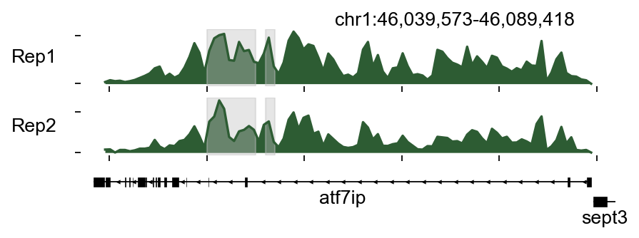
Plot track#
plot obtional#
If you wish to specify personalised plot colours, we provide here a few interesting parameters as input to plot_track.
color_dict: the color of each bigwig
region_dict: the region we interested
plot_names: the names of bigwig, if not provided ,it will use the keys of bigwig_dict
color_dict={
    'oocyte_H3K4me1_rep1':epi.pl.green_color[3],
    'oocyte_H3K4me1_rep2':epi.pl.green_color[3]
}
region_dict={
    'region1':[46050000, 46050000+5000],
    'region2':[46056000,46057000]
}
bw_obj.plot_track(chrom='chr1',chromstart=46039573,chromend=46089418,
                  plot_names=['Rep1','Rep2'],figwidth=6,figheight=1.5,
                  color_dict=color_dict,bp_per_bin=500,
                  region_dict=region_dict)
(<Figure size 480x180 with 3 Axes>,
 array([<Axes: ylabel='Rep1'>, <Axes: ylabel='Rep2'>, <Axes: >],
       dtype=object))
Plot Matrix#
Compute the tss/tes enrichment matrix#
Different genes have inconsistent chromatin activity in Chip-seq/ATAC-seq, as evidenced by differences in chromatin signaling before and after the TSS/TES locus, and we can find sample-specific TSS/TES signaling for downstream analysis. Here, we provide the function of compute_matrix to get the tss/tes enrichment matrix
bw_obj.compute_matrix('oocyte_H3K4me1_rep1',nbins=100,n_jobs=8)
└─ Compute matrix: oocyte_H3K4me1_rep1
  ├─ Prepare features
  ├─ Build matrices
└─ Finalize
└─ oocyte_H3K4me1_rep1 matrix finished
  └─ oocyte_H3K4me1_rep1 tss matrix in bw_tss_scores_dict[oocyte_H3K4me1_rep1]
  └─ oocyte_H3K4me1_rep1 tes matrix in bw_tes_scores_dict[oocyte_H3K4me1_rep1]
  └─ oocyte_H3K4me1_rep1 body matrix in bw_body_scores_dict[oocyte_H3K4me1_rep1]
(AnnData object with n_obs × n_vars = 33737 × 100
     obs: 'region_start', 'region_end'
     uns: 'range', 'bins',
 AnnData object with n_obs × n_vars = 33737 × 100
     obs: 'region_start', 'region_end'
     uns: 'range', 'bins',
 AnnData object with n_obs × n_vars = 33737 × 100
     obs: 'region_start', 'region_end'
     uns: 'range', 'bins')
The tss result will be stored in bw_tss_scores_dict['oocyte_H3K4me1_rep1'], and tes stored in bw_tes_scores_dict['oocyte_H3K4me1_rep1']. The obs represent the genes
bw_obj.bw_tss_scores_dict['oocyte_H3K4me1_rep1']
AnnData object with n_obs × n_vars = 33737 × 100
    obs: 'region_start', 'region_end'
    uns: 'range', 'bins'
After compute the tss/tes enrichment matrix, we can use save/load to save/load the result.
bw_obj.save_bw_result('result')
└─ Saving oocyte_H3K4me1_rep1 results...
bw_obj.load_bw_result('result')
└─ Load computed matrices
  ├─ Loading oocyte_H3K4me1_rep1 results...
└─ Loading oocyte_H3K4me1_rep2 results...
    └─ ⚠️  You need to run the compute_matrix function first for oocyte_H3K4me1_rep2!
    └─ ⚠️  You need to run the compute_matrix function first for oocyte_H3K4me1_rep2!
    └─ ⚠️  You need to run the compute_matrix function first for oocyte_H3K4me1_rep2!
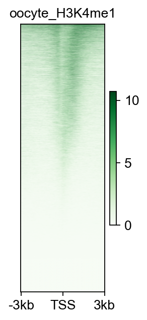
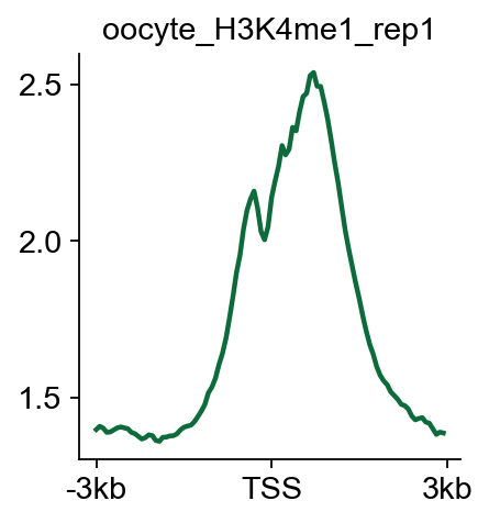
Plot the tss/tes enrichment matrix#
Here, we provide plot_matrix and plot_matrix_line to visualize the signal of tss/tes enrichment
fig,ax=bw_obj.plot_matrix(bw_name='oocyte_H3K4me1_rep1',bw_type='TSS',
                    figsize=(2,4),cmap='Greens',
                    vmax='auto',vmin='auto',
                   fontsize=12,title='oocyte_H3K4me1')
#fig.savefig('data/oocyte_H3K4me1_rep1.png',dpi=300,bbox_inches='tight')
bw_obj.plot_matrix_line(bw_name='oocyte_H3K4me1_rep1',bw_type='TSS',
                    figsize=(3,3),color='#0d6a3b')
(<Figure size 240x240 with 1 Axes>,
 <Axes: title={'center': 'oocyte_H3K4me1_rep1'}>)
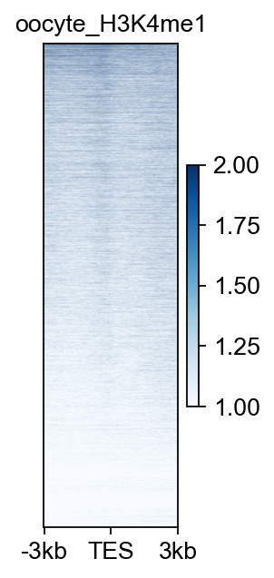
bw_obj.plot_matrix(bw_name='oocyte_H3K4me1_rep1',bw_type='TES',
                    figsize=(2,4),cmap='Blues',
                    vmax=2,vmin=1,
                   fontsize=12,title='oocyte_H3K4me1')
(<Figure size 160x320 with 2 Axes>, <Axes: title={'center': 'oocyte_H3K4me1'}>)
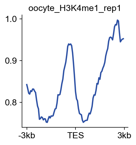
bw_obj.plot_matrix_line(bw_name='oocyte_H3K4me1_rep1',bw_type='TES',
                    figsize=(3,3),color='#2c50a4')
(<Figure size 240x240 with 1 Axes>,
 <Axes: title={'center': 'oocyte_H3K4me1_rep1'}>)
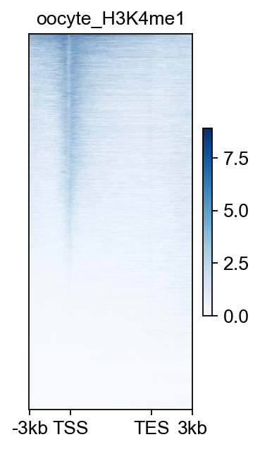
bw_obj.plot_matrix(bw_name='oocyte_H3K4me1_rep1',bw_type='all',
                    figsize=(2.5,4),cmap='Blues',
                    vmax='auto',vmin='auto',
                   fontsize=12,title='oocyte_H3K4me1')
(<Figure size 200x320 with 2 Axes>, <Axes: title={'center': 'oocyte_H3K4me1'}>)
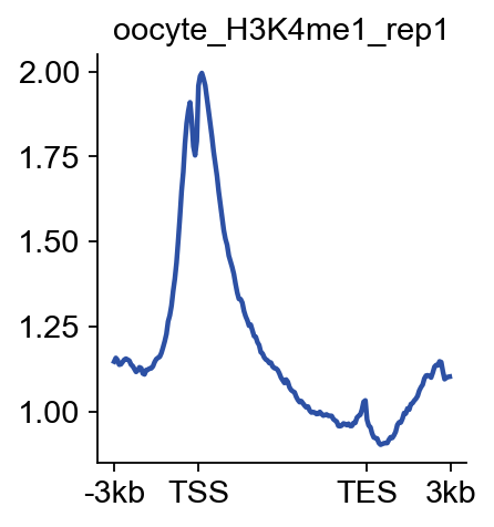
bw_obj.plot_matrix_line(bw_name='oocyte_H3K4me1_rep1',bw_type='all',
                    figsize=(3,3),color='#2c50a4')
(<Figure size 240x240 with 1 Axes>,
 <Axes: title={'center': 'oocyte_H3K4me1_rep1'}>)
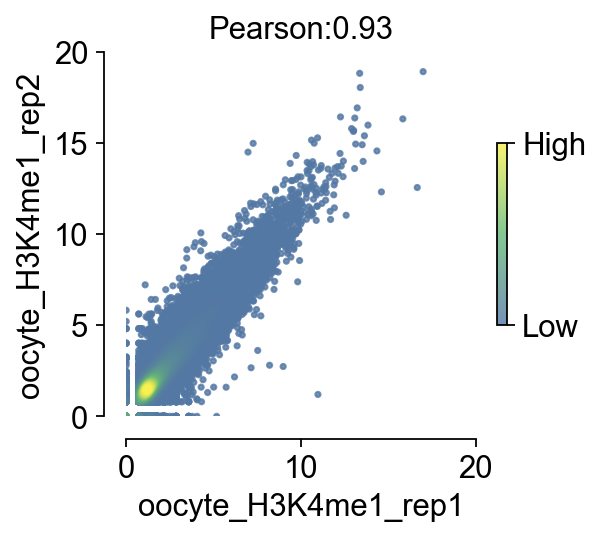
Plot the correlation between bigwig#
In addition to exploring the properties of the bigwig itself, sometimes we need to calculate the correlation between different bigwigs.
We set the size of each bin to 10000, i.e., the size of the region on the chromosome, and calculate the average chromosome signal value for each bin. and store it in the scoreperbindata
scoreperbindata=bw_obj.getscoreperbin(bin_size=10000,
                      number_thread=4,)
scoreperbindata.loc[scoreperbindata['chrom']=='chr24'].head()
| chrom | start | end | oocyte_H3K4me1_rep1 | oocyte_H3K4me1_rep2 | |
|---|---|---|---|---|---|
| 21338 | chr24 | 0 | 10000 | 1.075000 | 1.244246 |
| 21339 | chr24 | 10000 | 20000 | 1.860320 | 2.034103 |
| 21340 | chr24 | 20000 | 30000 | 1.771524 | 1.696709 |
| 21341 | chr24 | 30000 | 40000 | 1.186645 | 1.600000 |
| 21342 | chr24 | 40000 | 50000 | 2.283304 | 2.912770 |
scoreperbindata.head()
| chrom | start | end | oocyte_H3K4me1_rep1 | oocyte_H3K4me1_rep2 | |
|---|---|---|---|---|---|
| 0 | chr4 | 0 | 10000 | 4.174897 | 6.547932 |
| 1 | chr4 | 10000 | 20000 | 4.620073 | 6.031214 |
| 2 | chr4 | 20000 | 30000 | 3.288747 | 4.141955 |
| 3 | chr4 | 30000 | 40000 | 2.233796 | 2.431286 |
| 4 | chr4 | 40000 | 50000 | 3.510958 | 3.689173 |
We provide a nice visualization function to compare the correlation of two bigwigs, and for the purpose of visualization parameter tuning, we separate the value of the correlation from the visualization step to reduce the time spent repeating the computation when tuning the visualization parameters
bw_obj.compute_correlation(bw_names=['oocyte_H3K4me1_rep1','oocyte_H3K4me1_rep2'])
└─ The correlation between oocyte_H3K4me1_rep1 and oocyte_H3K4me1_rep2 is 0.93
  └─ Now you can use plot_correlation() to plot the correlation scatter plot
np.float64(0.930985887843024)
fig,ax=bw_obj.plot_correlation_bigwig(figsize=(3.5,3),
                                scatter_size=5,scatter_alpha=0.8,
                                fontsize=14)
#fig.savefig('data/correlation_bigwig.png',dpi=300,bbox_inches='tight')